Basic Colour Psychology Tips That Will Take You Far in Design
Have you ever picked a paint colour before because it “looked nice” on a tiny sample card, only to get it on the wall and think “what have I done?”
It happens more than we like to admit.
Colour feels simple, but it carries more weight than we realise. Once you understand how it affects mood, focus, and energy, you stop guessing and start designing with a bit more confidence.
Why colour feels bigger than it looks
You’ve probably had this happen. You paint a room, stand back, and think… why does this feel off? The furniture’s the same. The layout hasn’t changed. And yet something about it just doesn’t sit right.
That’s because colour isn’t just decoration. It changes mood. It changes energy. It changes how you feel walking into a space after a long day. Colour psychology affects design in ways we don’t always notice at first, but we definitely feel.
When you get it right, a room feels calm, warm, focused, or alive. When you get it wrong, you find yourself avoiding that space without knowing why. And that’s when you realise colour isn’t just paint on a wall. It’s atmosphere.
It’s not as strange as it sounds
Let’s be honest. The concept of colour psychology sounds strange at first. It can feel like one of those trendy ideas that designers throw around to justify their choices. Red means this. Blue means that. It can sound a bit dramatic.
But step back and think about it. You already react to colours. A bright yellow kitchen feels different from a dark navy one. A pale grey bedroom feels different from a deep burgundy one. You don’t need a degree to sense that.
It’s not magic. It’s pattern recognition. Over time, we’ve learned to associate colours with emotions, places, even memories. That’s what design taps into. Once you accept that, you stop picking colours randomly and start picking them with purpose.
Colours mean different things
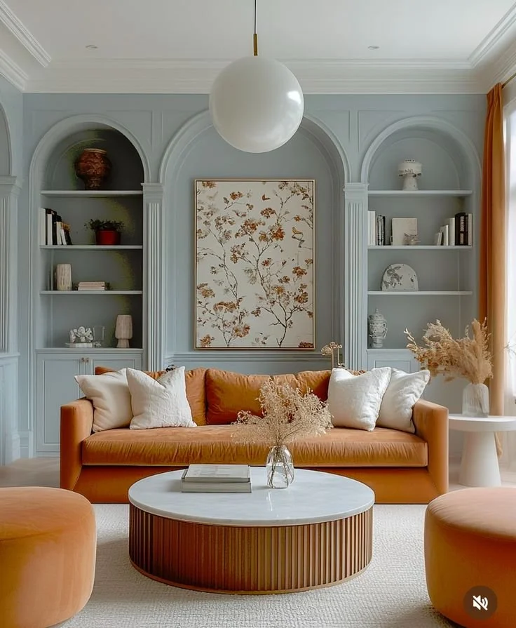
We don’t need to overthink it, but the meaning of different colours does come into play. Blues often feel calm and steady. Greens can feel fresh or grounded. Reds feel bold, energetic, sometimes intense.
You don’t have to memorise a chart. Just notice your own reactions. If a colour makes you tense, that’s useful information. If another makes you breathe a bit slower, that’s useful too.
Think about where you’re using it. A home office might benefit from something that helps you focus. A bedroom might need something softer. A dining room might handle something richer. When you connect colour to purpose, your design choices start making more sense.
Choosing the right colour for the right space
We’ve all stood in front of a wall of paint samples and felt completely overwhelmed. Choosing the right colour can feel like a huge commitment. What if you hate it in six months? What if it looks different once it’s on the wall?
Here’s the thing. Instead of asking what looks trendy, ask how you want to feel in that room. Calm? Energised? Cosy? Productive? Let the emotion guide you.

Test small patches. Live with them for a few days. Look at them in different lighting. Morning light and evening light can completely change how a colour behaves. When you give yourself time to notice those details, you stop rushing and start making smarter decisions.
Bold doesn’t mean chaotic
There’s always that moment where you’re tempted to play it safe. White. Beige. Light grey. They’re easy. They won’t offend anyone. But sometimes safe ends up feeling a bit lifeless.
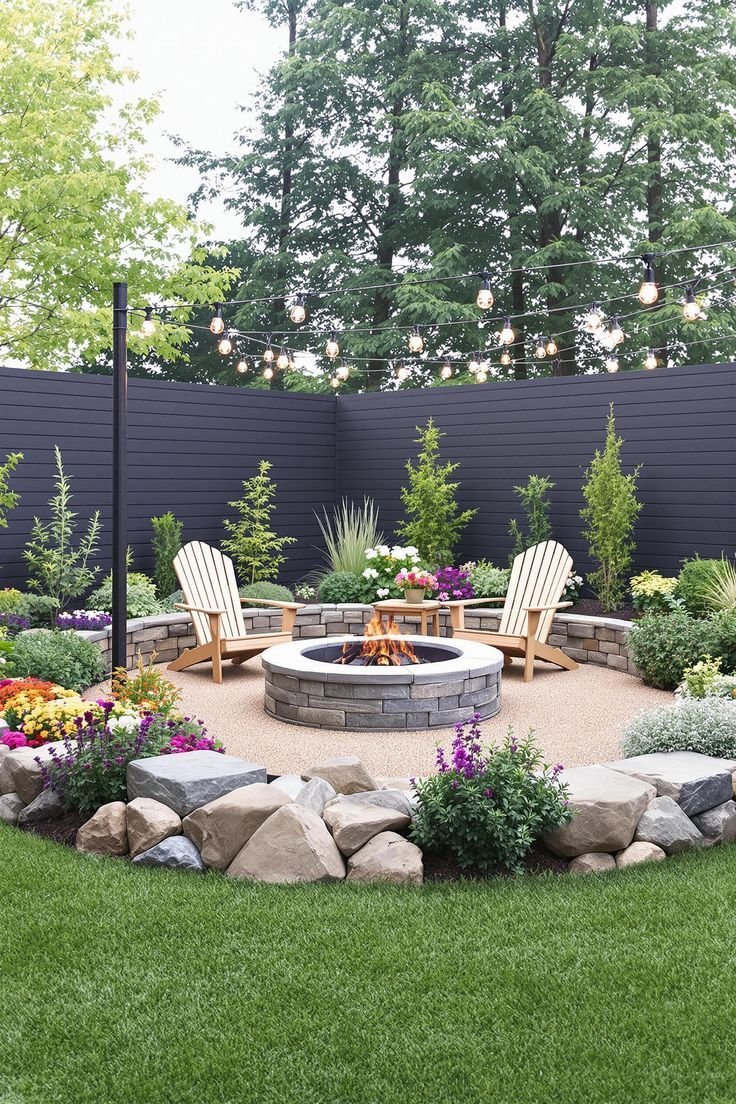
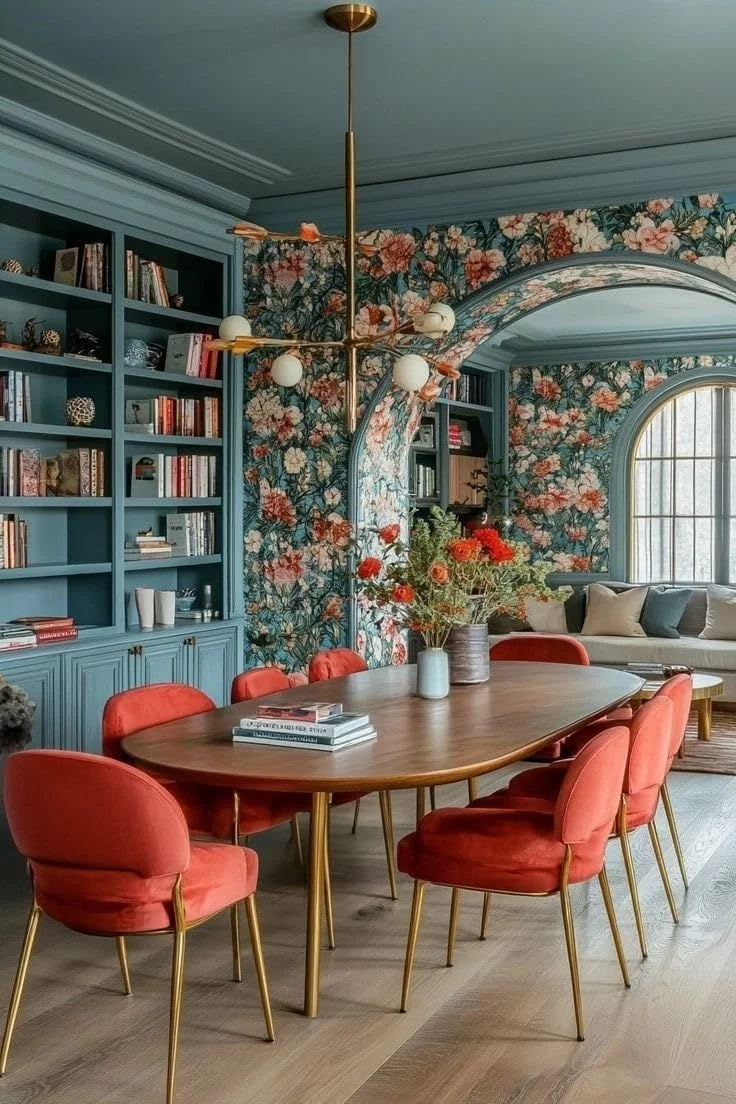
Bold options like green wall paint can completely transform a space when used thoughtfully. Deep green can feel grounding and elegant. A softer sage can feel calm and natural. It doesn’t have to scream at you to make an impact.
The key is balance. If you go bold on the walls, keep other elements simple. Let the colour breathe. That way, it feels confident rather than overwhelming. When bold is done well, it doesn’t feel chaotic. It feels intentional.
Consistency creates calm
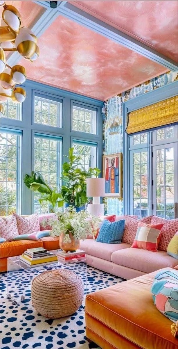
One mistake people make is treating every room like its own universe. Bright blue here. Burnt orange there. Deep purple somewhere else. Individually, they might look good. Together, they can feel chaotic.
There’s nothing wrong with variety. But some level of consistency helps your home feel connected. That doesn’t mean everything has to match. It just means the colours shouldn’t fight each other.
Think of your home like a playlist. Different songs, same vibe. When the colours flow naturally from one room to another, the whole space feels calmer. That sense of cohesion makes even smaller homes feel more put together.
Your home isn’t a mood board
Scrolling through design inspiration is fun. Perfectly staged rooms. Perfect lighting. Perfect everything. But real life isn’t a magazine spread.
You live in your home. You relax there. You argue there. You celebrate there. So your colours need to work for your real life, not just your Pinterest board.
If you’re working with a house painting company, be clear about how you actually use the space. Don’t just say you want something modern. Talk about your routines. Do you work from home? Have kids? Host often? Those details matter more than trends.
Colour decisions become easier when you stop trying to impress and start trying to support your lifestyle.
Small changes can change everything
You don’t always need a full repaint to feel a difference. An accent wall. New cushions. Artwork. Curtains. Even a rug can alter the tone of a room.
Sometimes the frustration we feel with a space isn’t about size or layout. It’s about visual energy. Too dark. Too flat. Too busy. Too cold. Tweaking colour is often the simplest way to reset that feeling.
Before you knock down walls or replace furniture, experiment with paint and textiles. It’s less risky. Less expensive. And often more effective than you expect.
Colour is feeling, not just decoration
At the end of the day, colour isn’t about impressing guests. It’s about how you feel walking into your own space. Tired? Inspired? Relaxed? Restless?
When you stop treating paint as a last-minute detail and start seeing it as a tool, everything changes. You choose with intention. You experiment thoughtfully. You trust your reactions.
And that’s usually when design stops feeling overwhelming and starts feeling empowering. You’re not just decorating anymore. You’re shaping the mood of your everyday life.